Upgrade & Secure Your Future with DevOps, SRE, DevSecOps, MLOps!
We spend hours scrolling social media and waste money on things we forget, but won’t spend 30 minutes a day earning certifications that can change our lives.
Master in DevOps, SRE, DevSecOps & MLOps by DevOps School!
Learn from Guru Rajesh Kumar and double your salary in just one year.
1. What is Bootstrap?
Bootstrap is a CSS framework which is use to develop web pages easily and it is faster also, .Bootstrap framework is totally free, it is a time saver for developer. Bootstrap has many design templates to make pages beautiful it has typography, forms, buttons, tables, navigation, modals, image carousels and many other, as well as optional JavaScript plugins. Bootstrap also provides ability to create responsive designs. Bootstrap was developed by Mark Otto and Jacob Thornton at Twitter, and released as an open source product in August 2011 on GitHub.

2. How to link bootstrap in HTML?
Copy-paste the stylesheet into your before all other stylesheet to load our CSS. Be sure to have your pages set up with the latest design and development standards. That means using an HTML5 doctype and including a viewport meta tag for proper responsive behaviors.
There are two ways to start using Bootstrap on your web site.
You can:
- Download Bootstrap from getbootstrap.com( Importing Bootstrap to HTML by directly download the files locally to your HTML project folder).
- Bootstrap from a CDN(Using the Bootstrap CDN is a great way to deliver the content from your website to your users quickly and efficiently based on their geographic location and improve your website server’s performance. To link Bootstrap in HTML using this method).
<link rel="stylesheet"href="https://cdn.jsdelivr.net/npm/bootstrap@4.6.1/dist/css/bootstrap.min.css" integrity="sha384-zCbKRCUGaJDkqS1kPbPd7TveP5iyJE0EjAuZQTgFLD2ylzuqKfdKlfG/eSrtxUkn"crossorigin="anonymous">3. Difference b/w bootstrap min.css & bootstrap css ?
BOOTSTRAP MIN.CSS is has been minified file off BOOTSTRAP. Minified file means all the whitespace and other extra characters have been removed for the file. This is commonly done for use in production, to reduce the size of the file. When developing, it is usually helpful to use the unminified version. And Bootstrap.css contains white space looks in organized way for that it contain more space then min.css.
4. Containers
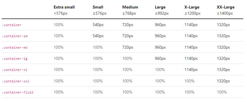
Containers are the most basic layout element in Bootstrap and are required when using our default grid system. Choose from a responsive, fixed-width container (meaning its max-width changes at each breakpoint) or fluid-width (meaning it’s 100% wide all the time). While containers can be nested, most layouts do not require a nested container. Containers provide a means to center and horizontally pad your site’s contents. Use .container for a responsive pixel width Use .container-fluid for a full width container, spanning the entire width of the viewport. .container-fluid for width: 100% across all viewport and device sizes.

Default container:
<div class="container">
  <!-- Content here -->
</div>
Responsive containers:
<div class="container-sm">100% wide until small breakpoint</div>
<div class="container-md">100% wide until medium breakpoint</div>
<div class="container-lg">100% wide until large breakpoint</div>
<div class="container-xl">100% wide until extra large breakpoint</div>
<div class="container-xxl">100% wide until extra extra large breakpoint</div>
Fluid containers :
<div class="container-fluid">
  ...
</div>
5.Bootstrap Grid System
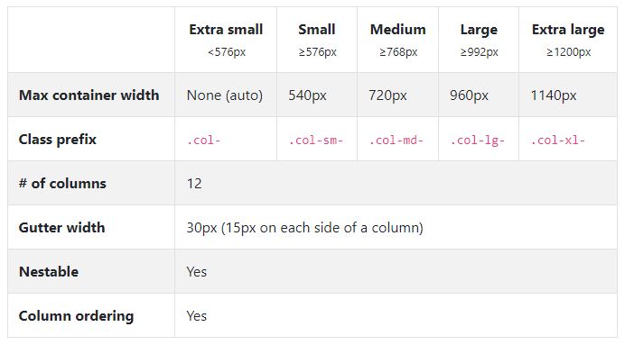
Bootstrap grid system has 12 columns is use to build layouts of all shapes and sizes, Our grid supports six responsive breakpoints. Breakpoints are based on min-width media queries, meaning they affect that breakpoint and all those above it (e.g., .col-sm-4 applies to sm, md, lg, xl, and xxl). This means you can control container and column sizing and behavior by each breakpoint. It contains five default responsive tiers. Bootstrap’s grid system uses a series of containers, rows, and columns to layout and align content. It’s built with flexbox and is fully responsive. Rows are wrappers for columns. Each column has horizontal padding (called a gutter) for controlling the space between them. This padding is then counteracted on the rows with negative margins. This way, all the content in your columns is visually aligned down the left side.
